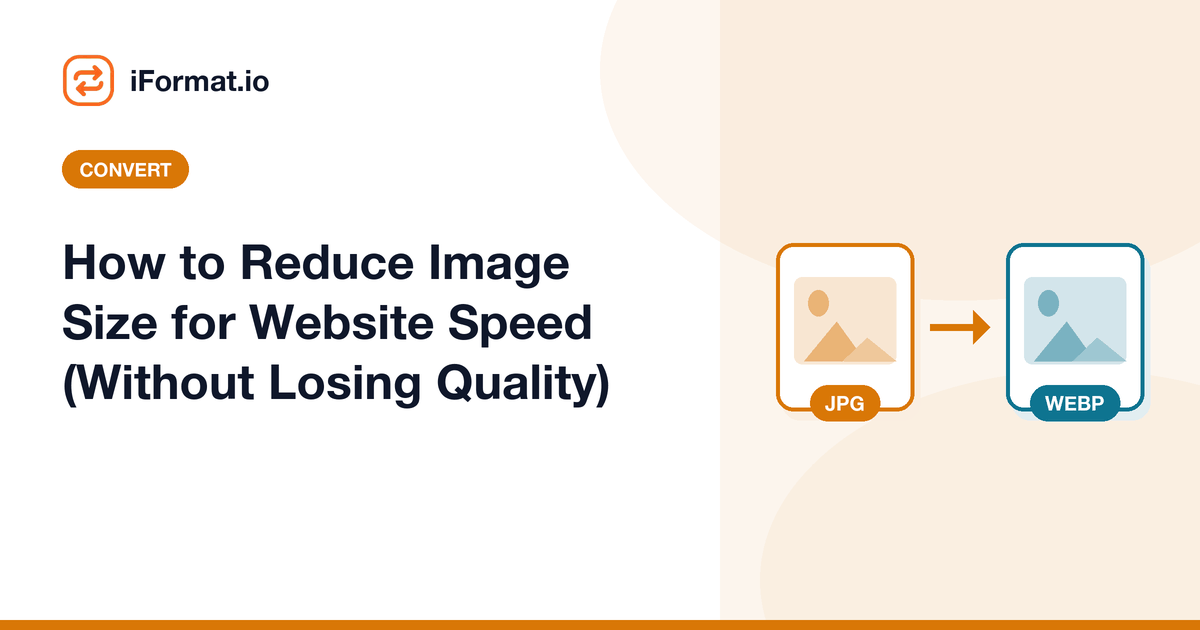
How to Reduce Image Size for Website Speed (Without Losing Quality)
Images make up over 50% of total page weight on most websites. A single unoptimised hero image can be 3-5 MB, which takes 4-8 seconds to load on a typical mobile connection. Google's Core Web Vitals, specifically Largest Contentful Paint (LCP), directly measures how fast your biggest visible element loads. For most pages, that element is an image.
Reducing image size is not about making images look worse. It is about removing data that the viewer's eye cannot detect while keeping the visual quality intact. Done correctly, optimised images are visually identical to the originals at a fraction of the file size.
Target File Sizes for Web Images
These are practical targets that balance quality and speed:
- Hero images (full-width banners): under 200KB. These are the LCP element on most pages.
- Product images and blog photos: under 150KB
- Thumbnail images: under 50KB
- Icons and UI elements: under 10KB (use SVG when possible)
- Background patterns and textures: under 30KB
- Total page image weight: under 1MB for the initial viewport, under 3MB for the full page
Step 1: Resize Dimensions
The most impactful optimisation is the one most people skip. A 4000x3000 pixel image displayed in a 800px-wide container is wasting 80% of its pixels. No visitor will ever see those extra pixels — they are just dead weight that the browser downloads and then discards.
- Full-width hero images: 1920px wide maximum. No screen wider than 1920px is common enough to optimise for, and responsive images with srcset handle the rest.
- Blog content images: 1200px wide maximum. Blog content columns are rarely wider than 800px, but 1200px covers high-DPI (Retina) displays at 2x.
- Thumbnails: exact display size multiplied by 2 for Retina. If a thumbnail displays at 200x200, make it 400x400.
- Product images: 1000-1500px on the longest side. Enough for zoom functionality without being excessive.
Step 2: Convert to a Modern Format
JPEG and PNG have been the web standards for 25 years, but modern formats deliver the same quality at significantly smaller file sizes.
WebP is the practical choice for 2024 and beyond. It produces files 25-35% smaller than JPEG at the same visual quality. Browser support is universal: Chrome, Firefox, Safari, Edge, and every modern mobile browser support WebP. Unless you need to support Internet Explorer (which Microsoft discontinued in 2022), WebP works everywhere.
AVIF is the next-generation format, producing files 30-50% smaller than JPEG. Browser support is good and growing: Chrome, Firefox, and Safari 16.4+ support AVIF. The downside is that encoding AVIF is slower than WebP, and some CDNs and CMSs do not support it yet.
Convert your JPEGs and PNGs to WebP using the JPG to WebP converter. If your PNG has transparency, WebP preserves it — you do not need a separate format.
When to Keep PNG
Use PNG only for images that need pixel-perfect accuracy: screenshots of UI, images with text overlays, technical diagrams, and logos with sharp edges. For photographs and illustrations, WebP is always smaller. For icons, SVG is better than either.
Step 3: Compress Quality
After resizing and converting, compression is the final optimisation. JPEG and WebP quality settings range from 0 (lowest quality, smallest file) to 100 (highest quality, largest file).
- Quality 80-85%: the sweet spot for web images. Visually indistinguishable from 100% for photographs. This should be your default.
- Quality 70-75%: minor softening visible if you zoom in and compare side by side. Perfectly acceptable for thumbnails and background images.
- Quality 60-65%: noticeable softening. Use only for images where file size is critical and quality is secondary (decorative backgrounds, placeholder images).
The image compressor shows a before/after preview so you can see exactly what the quality difference looks like before committing.
WordPress-Specific Tips
WordPress sites often have the worst image optimisation because contributors upload photos directly from their cameras without any processing.
- Set maximum upload dimensions: use a plugin like Imagify, ShortPixel, or Smush to automatically resize uploads to a maximum of 2048px wide. This prevents 6000px originals from clogging the media library.
- Enable WebP conversion: all major optimisation plugins can convert uploaded JPEGs and PNGs to WebP automatically and serve them to supported browsers.
- Regenerate thumbnails: after installing an optimisation plugin, regenerate existing thumbnails to apply the new compression settings to your entire media library.
- Lazy load images below the fold: WordPress 5.5+ adds
loading="lazy"to images automatically. Verify it is not disabled by your theme.
Using a CDN for Image Delivery
A Content Delivery Network caches your images on servers around the world and serves them from the location closest to each visitor. Cloudflare, Bunny CDN, and AWS CloudFront all offer image optimisation features that resize, convert, and compress images on the fly based on the requesting device.
With a CDN, you upload one high-quality original and the CDN generates optimised variants for every device. A phone gets a 640px WebP, a laptop gets a 1200px WebP, and a legacy browser gets a 1200px JPEG — all from the same source image.
Measuring the Impact
After optimising images, measure the improvement using PageSpeed Insights or Chrome DevTools. Check LCP (should be under 2.5 seconds), total page weight, and the number of image requests. A well-optimised page loads visibly faster and ranks better in search results because Google uses Core Web Vitals as a ranking signal.
Compress Your Website Images
Reduce file size by 60-80% with no visible quality loss. Supports JPG, PNG, and WebP.